By BARBARA ROBERTSON
By BARBARA ROBERTSON

The surprisingly quick success of Marvel’s first Spider-Man comic in 1962 has led to more than 50 years of comics, cartoons, books, video games, TV series and films. IMDb alone lists more than 1,000 Spider-Man titles.
None of these are like the latest, Spider-Man: Into the Spider-Verse, an animated feature from Columbia Pictures, Sony Pictures Animation and Marvel Entertainment – and that was the intention.
Developed by writers/directors Phil Lord and Christopher Miller (The LEGO Movie, Cloudy with a Chance of Meatballs) and directed by Bob Persichetti, Peter Ramsey and Rodney Rothman, the film isn’t set in the same world as any of Sony’s other Spider-Man films. Instead, it takes place in a multiverse. The Spidey star is a Puerto Rican, African-American high school student from Brooklyn named Miles Morales, but he’s only one of many Spider-People, each with his or her own moves.
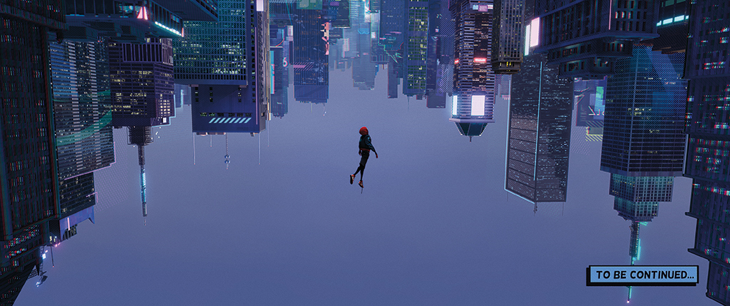
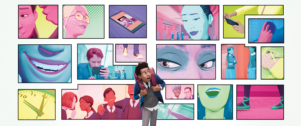
Animators and artists at Sony Pictures Imageworks, many of whom had worked on Lord and Miller’s Cloudy with a Chance of Meatballs, gave that alternate world a unique look and feel, creating a stylish, action-packed animated film that explodes with color. The characters created by blending CG and hand-drawn techniques into a comic-book aesthetic look fresh and new. Sometimes we see semi-realistic environments, sometimes abstract patterns.
“Chris and Phil’s mandate from the beginning was to make this film look like something we’ve never seen before,” says Visual Effects Supervisor Danny Dimian. “Something that would make people wonder how it was made.”
Dimian began working on the film in pre-production, nearly three years before the scheduled release date. Small teams started with tests to determine how they could realize the filmmakers’ vision.
“We took the visual language of comic books and made an immersive movie variant, and tried to do that efficiently in a way that worked for the entire pipeline – animation, lighting, effects,” says Josh Beveridge, Animation Director. “A lot of us were high five-ing when we got a system, a plan that worked.” To create that plan, the artists had to veer into unknown territory. The film sends Spider-Man into an alternate universe. The artists making the film landed in alternate visual effects and animation universes as well.
“When we brought artists onto the show, we asked them to reconsider how they do everything,” Dimian says. “We told them, ‘If it ain’t broke, break it.’ Early on we wanted to see what mistakes we could find that looked interesting.”
With an eye toward comic book illustration, the team considered color, line and form rather than animation styles to develop their plan. They wanted to simplify the look by removing the complexity in modern animation, yet keep the characters engaging and emotional. They decided to focus on simple models and hand-drawn details. Line work would be the answer.
“We developed a line-drawing system in Houdini and tied it into Maya,” Dimian says. “Artists can draw on the [3D] object, changing the weight and taper of a line. But that is just the starting point. We created two types of lines, lines for acting and emotion, and lines for form. The main point is that these lines are independent from the form, whether hand-drawn, rigged or drawn through machine learning.”
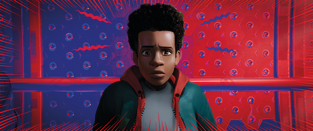
The acting lines used for facial performances start as drawings with the type of tapering typical in illustrations. The line-drawing system converts these hand-drawn lines into geometry curves that can be animated like any other rigged geometry. But they are not tied to muscles or shapes.
“An illustrator can draw for emotion and completely contradict what the underlying geometry does, so we completely de-coupled the acting lines from the form, too,” Dimian says. “These acting lines can follow the form when we want them to, or break free when we want, and make expressions to just the camera view. So the lines work well in stereo, too.”
“We took the visual language of comic books and made an immersive movie variant, and tried to do that efficiently in a way that worked for the entire pipeline – animation, lighting, effects. A lot of us were high five-ing when we got a system that worked.”
—Josh Beveridge, Animation Director

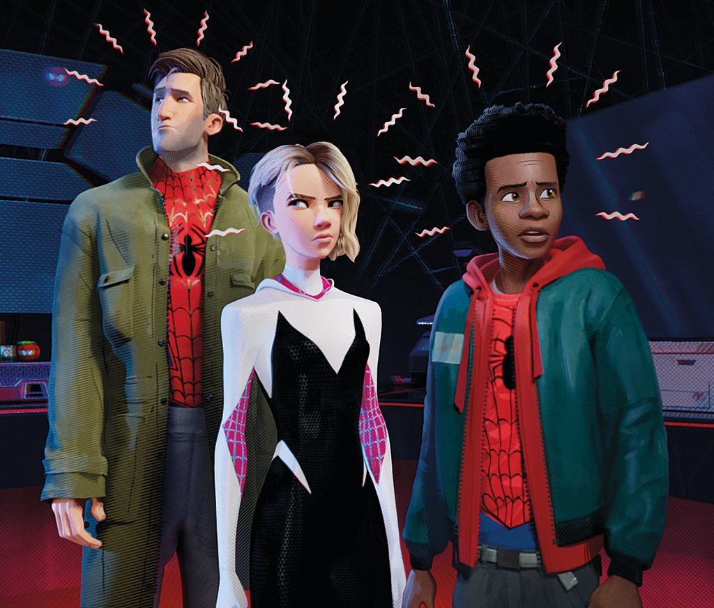
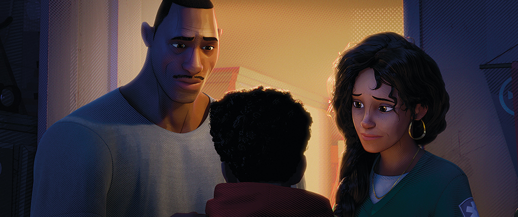
The result gave animators new methods for creating facial performances for the 3D models. Rather than sculpting wrinkles, animators use these 2D acting lines to create expressions.
“We have little lines, little splines, that we can move and shape as we like, all built into the rig,” Beveridge says. “And we can add more. The characters don’t look ‘on model’ until we have these expression lines.”
“We developed a line-drawing system in Houdini and tied it into Maya. Artists can draw on the [3D] object, changing the weight and taper of a line. But that is just the starting point. We created two types of lines, lines for acting and emotion, and lines for form. The main point is that these lines are independent from the form, whether hand-drawn, rigged or drawn through machine learning.”
—Danny Dimian, Visual Effects Supervisor
All told, more than 150 animators worked on Spider-Verse, the biggest team Imageworks has ever had on a film, according to Beveridge. He organized them with sequence leads, nine in all. Although the team didn’t have official character leads, animators gravitated toward those with a knack for performing certain characters.
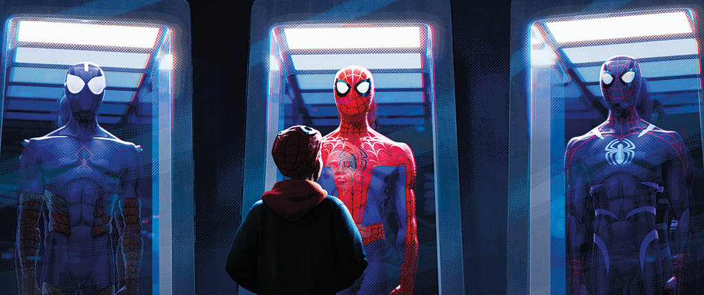
“We have characters that are very different, and each has its own rules,” Beveridge says. “Every Spider-Person has a different background and moves differently. We find the characters through exploration. Even before we had the characters move, we explored the characters’ aesthetic through camera tests.”
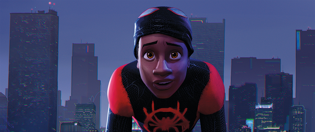
The first characters explored were Peter Parker and, in particular, Miles Morales, who needed to be obviously unique. When they were happy with his aesthetic, he became a benchmark, and they began doing motion tests that allowed other departments to test their techniques.
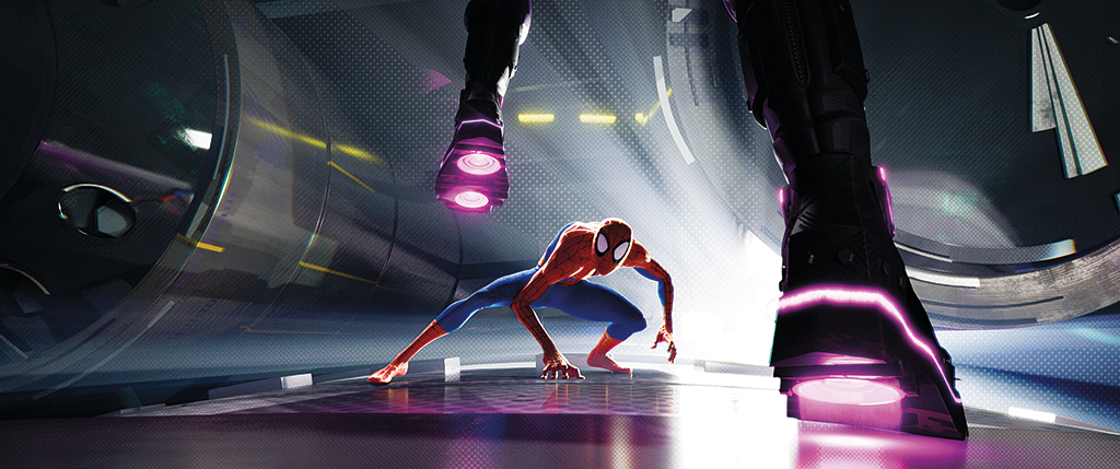
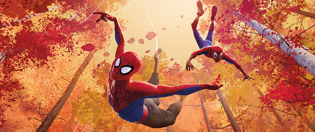
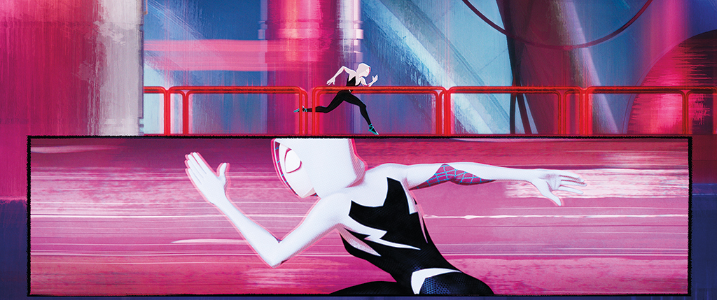
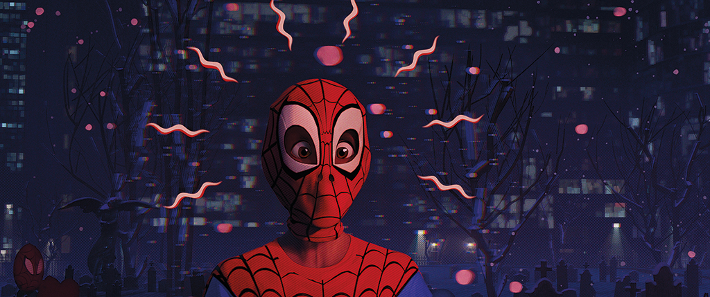
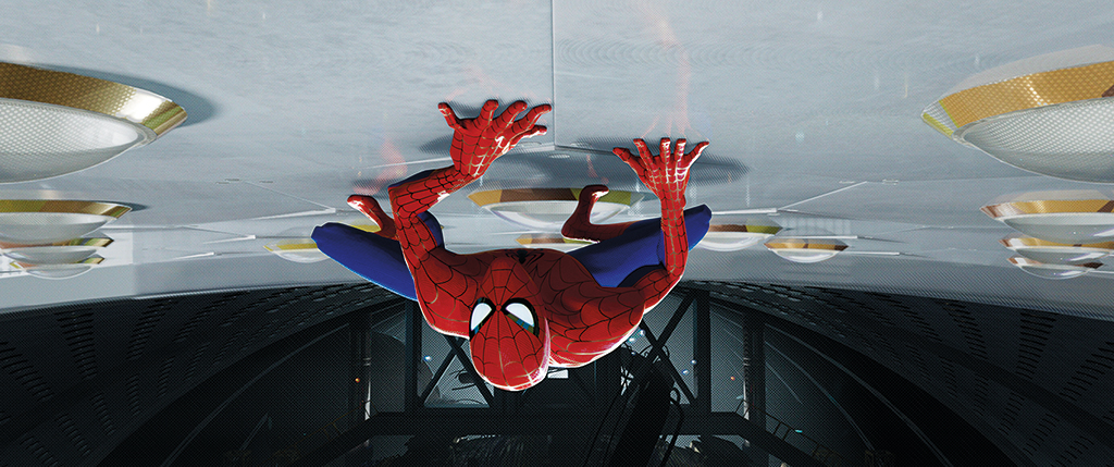
To give the Spider-People a snappy style the comic book aesthetic demands, the teams decided to forgo motion blur. Instead, animators drew streak lines to give the appearance of motion, and lines off the characters that connected with the form. They also decided to use stepped animation, which is loosely categorized as animating on 2s.
“Animating on 2s doesn’t mean mathematically every other frame,” Beveridge says. “More often than not, it’s 12 frames per second, but it’s a fluid scale. Sometimes we might have a 60-frame shot with the first 16 on 2s, then a 3-frame hold, then one’s. It’s dynamic. Something musical. Every animator finds the flavor for a scene. Our boundaries are to stay away from strobe and mush.”
The lack of motion blur accents that style.
“If you stop on any frame in the movie, it’s solid, sharp,” Dimian says. “In the ‘70s we had an effect where every frame was held, so we got a trail of previous images with traced-out lines. We have that kind of style. A non-blurred image that’s stepped behind another in the animation curve.”
They pushed other techniques as well, many borrowed from 2D animation and illustration. With a “pose stamp” tool, for example, the animators could work with a duplicate of any character in a pose.
“It’s a brick,” Beveridge says of the “pose stamp.” “A dummied-down duplicate of a rig without a rig. We can use it to smear an object across space, and use portions of it to fill in gaps with multiple limbs.”
Adds Dimian, “We’ve always done smearing of geometry – when you pause on a frame, the character might be a blobby smear through the animation, like with a trailing smeared arm and elastic stretching – but we pushed that further. We’ve also broken the characters into pieces. You’ll see extra arms and other shapes that fill in gaps. You’ll see pieces of the model floating, edges that don’t connect, a wrinkle floating off the surface. The cap of a fire hydrant might not be on it. A cushion might float off a chair. But it looks right.”
The result could have looked visually confusing, but the team learned how to maintain a consistent visual language.
“It works because it’s not arbitrary,” Dimian says. “There are rules to it all; it plays right. We found that these imperfections had to be accents, secondary actions, or embellishments. They couldn’t be the main structure or form. It ends up being a case-by-case-based thing.”
Given the unique aesthetic and animation style, the team needed to find new ways to handle fast camera pans without using motion blur, and to create new types of lensing effects consistent with illustration, not realism.
“We needed to pan a camera quickly and have continuity,” Dimian says. “For a simple object like a moving train or other predictable geometry, the effects team added geometry – motion lines on top – or smears, building the geometry into the model. The renderer [Arnold] responded to the highlights or color patterns represented by additional geometry. We tried to do as much as possible automatically, then have the artists fine tune.”
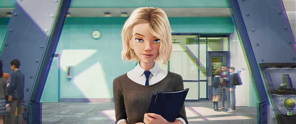
For a lensing effect, the team referenced old comic books, especially those with misprinted pages where the registration didn’t line up right.
“We have the same image offset,” Dimian says. “It isn’t a blur. It isn’t out of focus. It’s an image with different colors offset based on z-depth, so it looks out of focus. But it feels natural because we use it consistently.”
Because color, line and form are more important for this film than realistic materials, the team also needed to find a way to represent objects as if they had been printed, not rendered with a ray tracer.
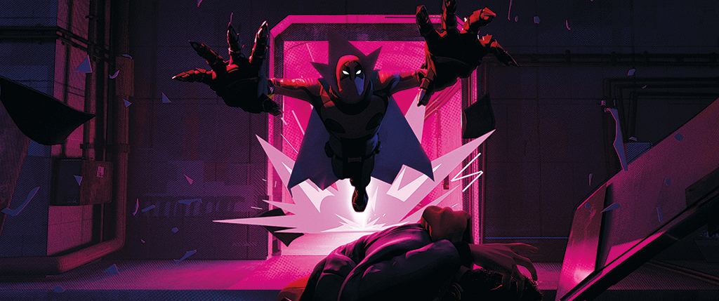
“We looked at old screen-printed comics,” Dimian says. “They used half-toning and line-hatching, so we came up with hatching and half-toning techniques in the render and in compositing, too.”
Half-toning represents colors with dots. Moving from larger to smaller dots creates grads, and that’s what the team mimicked.
“The comic book illustrators didn’t draw anything that was really soft, so we tried not to have anything blurry,” Dimian says. “We tried to avoid grades by turning those into half-toning, and avoided traditional material looks by having them quantized using brush strokes and other ways to break up the form. We would have stepped values to avoid smooth grads, and then broke those up with half-toning. A lot of our shadows were hatches. We’d combine line work, thick to thin, to get an overall value.”
The half-toning and hatching were procedurally-based techniques, some done in shading and some with shaders giving passes to compositors who would half-tone and hatch.
“The majority of half-toning and hatching is compositing based using render passes,” Dimian says. “We still have bounce light and all that, and we still had to make things hard, soft, shiny and dull, but we abstracted it away from a ray-traced look.”
Similarly, the effects artists realized early on that fully simulation-based effects wouldn’t do. They needed to create effects in a comic book illustration style. “We used lots of animation cycles that are completely 2D, much like those you’d create for a 2D movie or an anime,” Dimian says. “We’d tie them to sprites and mix with simulation.”
The artists would start with 2D cycles, feed them into a system, and then add volume with 3D simulation to create forms that would read well in stereo. “Clouds and fire start flat with 2D animation that we build with little pieces,” Dimian says. “Then we give them form with 3D simulation or split them into layers to make them not flat. When we use 3D simulation, it’s stylized to be simple forms, not realistic. The important thing is that the way the simulation changes form, how it evolves over time, is an artistic choice.”
The nature of the new aesthetic required more collaboration among people working on different parts of the pipeline.
“Everyone is always doing an incomplete portion, and something slightly out of their comfort zone,” Beveridge says. “We try to keep it a linear process, but we had a lot of forward and backward communication. It was very exciting.”
As might be imagined, the new techniques required much trial and error, and many failed experiments fell by the wayside before the team discovered a good path.
“Our artists had to be reminded that it’s safe to explore and that we wanted them to take risks,” Dimian says. “We all work hard and fast and it’s a rare opportunity to be purposely looking for things that are broken or to experiment without knowing exactly what you want. We had to make sure our artists felt supported in this. My personal concern was to find something that turns into enough of a language that there’s a consistency so that you’re swept away by the story – you’re just in it.”
Clearly, the team met Lord and Miller’s mandate to make something never seen before. Early reactions suggest they have also accomplished something even more difficult – to create a new, seamless language that supports both the characters and the story.