By IAN FAILES
By IAN FAILES

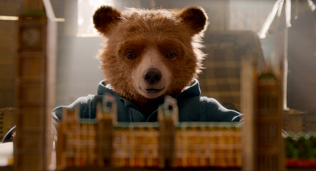
In Paddington 2, Paul King’s follow-up to his live-action tale of the famous storybook bear, the titular character gives his Aunty Lucy a tour of London. The twist is that the tour takes place within the (imaginary) realm of a paper pop-up book.
Framestore, which already had the challenge of crafting Paddington and other furry characters for the film, realized the pop-up book sequence. In this special report, VFX Voice asked multiple members of Framestore’s team about how it was put together.
Andy Kind, Visual Effects Supervisor: It was a wonderful challenge to create a paper world that our bears could inhabit and feel part of. The camera moves needed to be graceful and tie into the folds of each of the page turns and follow the bears as they explore their paper environment.
Dale Newton, Animation Supervisor: We started off with a storyboard animatic, and director Paul King had hammered through some ideas of what he envisaged for the transitions. A lot of production design and art direction had already gone into creating the book, so we had all of the illustrations on hand that had gone into the book.
We produced low-resolution CGI versions of all the parts of the book, and at that stage we didn’t get any rigging involved, it was purely for animation. I had a modeler working with me to quickly scan all the bits of artwork and get them represented as low-res polys. Then we put that geometry together and started to put some cameras together to show Paul some first versions. I worked closely with Animation Director Pablo Grillo to refine and craft the cameras. It quickly became evident that Paul was after something a lot more elaborate. It wasn’t really just what was in the book, it had to be the whole of London.

Andy Kind: One of the biggest aids to realizing this sequence was talking to Page Engineer David Hawcock. He designed mock-ups of the pages in the book to give an idea of scale and how the paper would fold in the real world.
Neil Weatherley, CG Supervisor: The pop-up mechanism was probably the biggest challenge as pretty much everything in the sequence needed a custom way of folding up and/or down. As we were working with an illustrator giving us some artwork to use, we decided to approach it in a real-world way by creating the images in a flat-pack form then building our rigs using the images in these flat cards, based on some concept pop-up books built for reference. While we were still in layout/previs stage we still needed the ability for a lot of these rigs to move around on the page, while also keeping some of the larger set pieces driven by the opening/closing of the pages, as that would be changing in the edit. It was also a mammoth task to do technical checks on the animation to make sure nothing was intersecting when it came to finaling it!
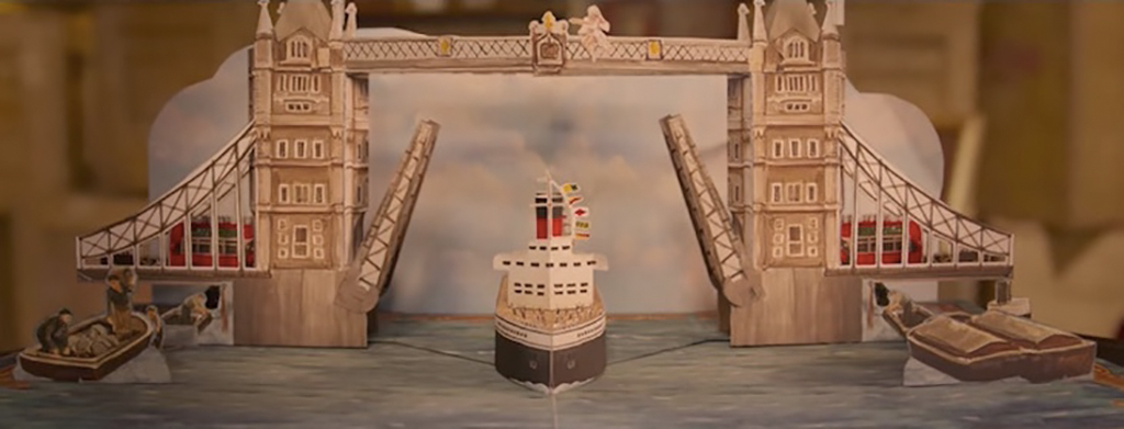
Jarl Midelfort and Léa Vera Toro, Rigging TDs: The shot just before we enter the pop-up world was actually one of the more challenging pop-up rigging tasks. Paddington is inside Mr. Gruber’s shop and opens the pop-up book, revealing a fully CG Tower Bridge pop-up page. We had to closely match our rigged Tower Bridge behavior to the practical version of that prop, because a real version of the same tower bridge pop-up page would be seen at other points in the film.
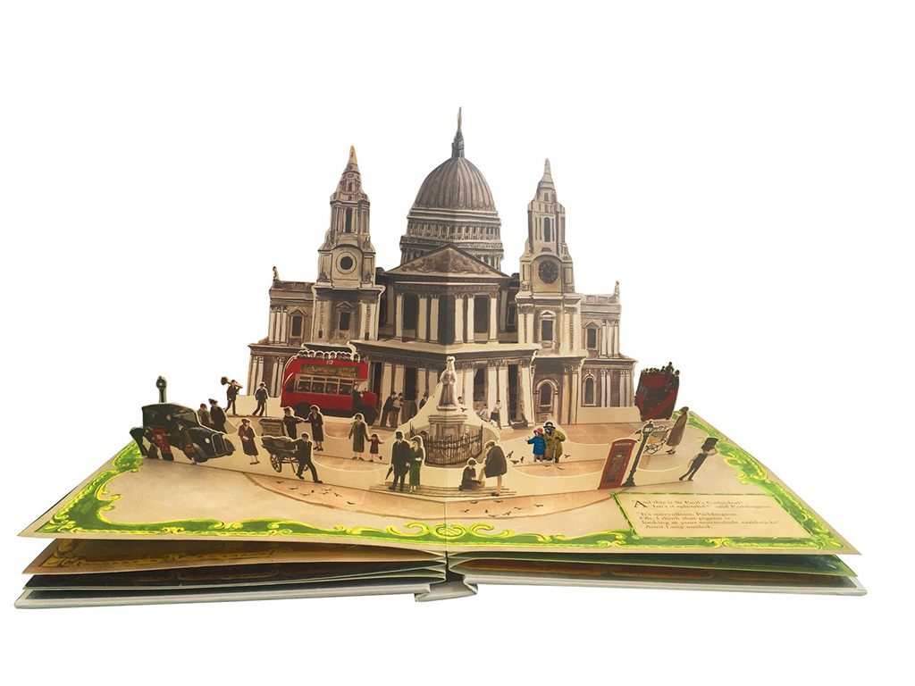
Some of the other London landmarks within the pop-up world were also challenging, for example: St. Paul’s Cathedral; the iconic, red double-decker buses; and Big Ben. However, since we didn’t see most of them folding in their entirety or because they didn’t exist in real life, this meant that we didn’t need to build them to be as physically plausible as Tower Bridge. At the same time, they each had their own unique styles of folds and animation requirements, leading to some unique rigging challenges. For example, with the double-decker buses we had automatic wheel rotation plus folding behavior. This led to a slightly more complex setup than your average car rig, where the wheels in their rotated state also needed to behave as expected when the buses started to fold.

Dale Newton: While we knew a bit about the mechanics of a paper fold, a lot of the folds that we suggested in the sequence aren’t necessarily real – they require the placement of whatever it is you’re folding to be along the central spine. But we knew that the audience would be lost in the detail of the scene, and that we would be forgiven for these lies.
Then there was quite a lot of work that went in to the transitions, to make sure that the timing felt good and that we had an exciting a part of London to look at. It was very important to Paul that it had to be an unfolding journey and we got to see London through Paddington’s eyes as he was to show it to Aunt Lucy; so that we caught the grandeur, the sparkle and the magic of Piccadilly as we arrived there, for example, or that St. Paul’s felt grand and big, and Big Ben likewise.
Jarl Midelfort and Léa Vera Toro: We were able to reuse a lot of our rigging work from the first film for Paddington and Aunt Lucy, focusing our work on improving key areas such as the eyes and some facial expressions. However, we did completely rebuild Paddington’s dufflecoat, which was remodeled in Marvelous Designer this time around. We re-approached the dufflecoat rigging to provide a more cloth-like behavior in terms of length preservation in areas like the sleeves. We also exposed a finer level of animation control so that animators had a greater ability to really shape the coat. This same style of rigging was also used for other costume rigs in this sequel; for example, Paddington’s prison and barber shop costumes.
Oliver Armstrong, Compositing Supervisor: The sequence was put together in three main sections. The opening, beginning in Gruber’s Antiques shot on camera, then enters the world of the pop-up book and transitions through two set-piece page turns in compositing to reveal each landmark London location. Deep compositing was used to add Paddington and Aunt Lucy into the complex layering of the CG scene. This was all then composited over a NUKE-projected sky illustration.
Neil Weatherley: The biggest issue was scale. We didn’t want it to feel like tiny bears in a ‘real-scale’ book, but we also needed the audience to feel they were inside the pop-up book. So we kept the bears at their regular scale then built the ‘paper’ world around that and took the time to work out how much paper detail to show like grain, fiber, etc. In the end, it was all quite subtle and used where needed so it didn’t take over the look. In terms of lighting, it also dictated how thick the paper was, as we wanted to allow a bit of light coming through; otherwise, it would all get very shadowed. This also meant we got a nice soft look, as there was light coming through everywhere.
Oliver Armstrong: It was always the goal to create the feeling of real-world space and lighting within the world of the pop-up book. It was a challenge to keep that feel while within an illustration, but it was achieved by matching real-world depth hazing and de-focus to maintain the feeling that we are in a large-scale environment. It was important that the shot not feel like a miniature. The grading of the sky was key to keeping that real-world look. Adding lens effects, bloom and flaring sells the presence of the sunlight in the scene.